knn_boundaries <- function(x, k) {
  if (is.unsorted(x)) x <- sort(x)
  N <- length(x)
  left <- right <- numeric(N)
  l <- left[1] <- 1
  r <- right[1] <- min(k, N)
  for(i in seq_along(x)[-1]) {
    while (r + 1 <= N && x[i] - x[l] >= x[r + 1] - x[i]) {
      r <- r + 1
      l <- l + 1
    }
    left[i] <- l
    right[i] <- r
  }
  list(left = left, right = right)
}

knn_S <- function(x, k) {
  nn <- knn_boundaries(x, k)
  N <- length(x)
  S <- matrix(0, N, N)
  for(i in seq_along(x)) {
      S[i, nn$left[i]:nn$right[i]] <- 1 / k
  }
  S
}Solutions to Exercises Week 3
Keywords: premature optimization
Exercise 3.4
Q: Consider the following two functions, k_smallest() and knn_S_outer(). Explain how knn_S_outer() implements the computation of the smoother matrix for k-nearest neighbors. Compare the implementation with knn_S(). Using the greenland data, explain any differences between the smoother matrix computed using either function.
Solution: We first take the function knn_S from the book
And the function knn_S_outer from the exercises
k_smallest <- function(x, k) {
  xk <- sort(x, partial = k)[k]
  which(x <= xk)
}

knn_S_outer <- function(x, k) {
  D <- outer(x, x, function(x1, x2) abs(x2 - x1))
  N <- length(x)
  S <- matrix(0, N, N)
  for(i in 1:N) {
    k_indices <- k_smallest(D[i, ], k)[1:k]
    S[i, k_indices] <- 1 / k
  }
  S
}
Then we can plot the two smoothed curves
x <- greenland$Temp_Qaqortoq
y <- greenland$Temp_diff
ord <- order(x)
x_ord <- x[ord]
y_ord <- y[ord]

S1 <- knn_S(x, k = 100)
S2 <- knn_S_outer(x, k = 100)

preds_S1 <- S1 %*% y_ord # S1 requires sorted x
preds_S2 <- S2 %*% y # S2 does not require sorted x

p_greenland <- ggplot(greenland, aes(Temp_Qaqortoq, Temp_diff)) +
  geom_point(shape = 16, alpha = 0.3) +
  xlab("Temperature Qaqortoq") +
  ylab("Temperature difference") +
  geom_line(aes(y = mean(Temp_diff)), linetype = 2, linewidth = 1)

p_greenland +
  geom_line(aes(x = x_ord, y = preds_S1), color = "blue", lwd = 1) +
  geom_line(aes(x = x, y = preds_S2), color = "red", lwd = 1)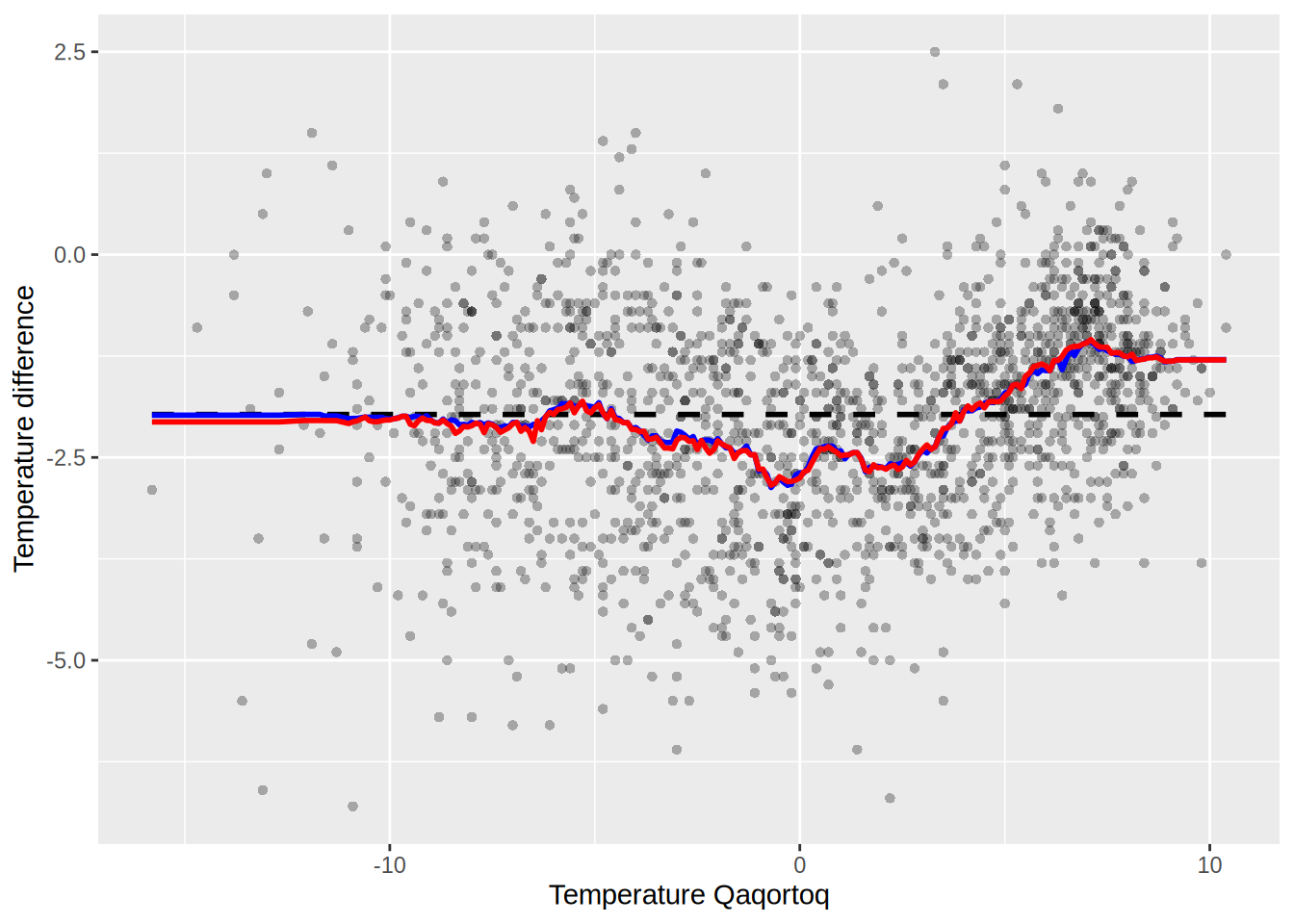
Are they the same? compute the following
max(abs(preds_S1 - preds_S2))[1] 1.757seems like not quite the same.
plot_matrix <- function(S) {
  # Convert the matrix to a data frame
  S_melt <- melt(S)

  # Plot the matrix using ggplot
  ggplot(S_melt, aes(Var1, Var2)) +
    geom_tile(aes(fill = value > 0), color = "white") +  # Color based on value > 0
    scale_fill_manual(values = c("FALSE" = "white", "TRUE" = "red")) +
    scale_y_reverse() +
    theme_minimal() +
    theme(axis.text.x = element_text(angle = 90, hjust = 1)) +  # Rotate x-axis labels
    labs(x = "Column", y = "Row", fill = "Value > 0") +
    coord_fixed()  # Ensure square aspect ratio
}
Plot the two matrices
plot_matrix(S1)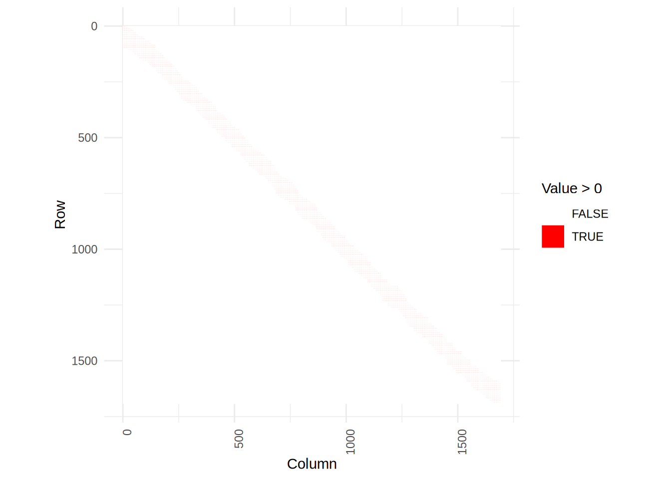
plot_matrix(S2)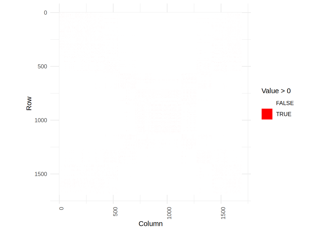
We see that the smoother matrix of S2 is more scattered, but that is because it doesn’t assume the input to be sorted.
Exercise 5.1
Q: Implement simulation from the exponential distribution as in Example 5.1 but replacing 1-U by U. Test your implementation and benchmark it against the implementation in Example 5.1, against rexp() and against dqrng::dqrexp() from the dqrng package.
Solution:
sim_exp <- function(n, lambda = 1) {
  u <- runif(n)
  -log(u) / lambda
}
We simulate for n = 1000 and plot the results
X <- sim_exp(1000)
hist(X)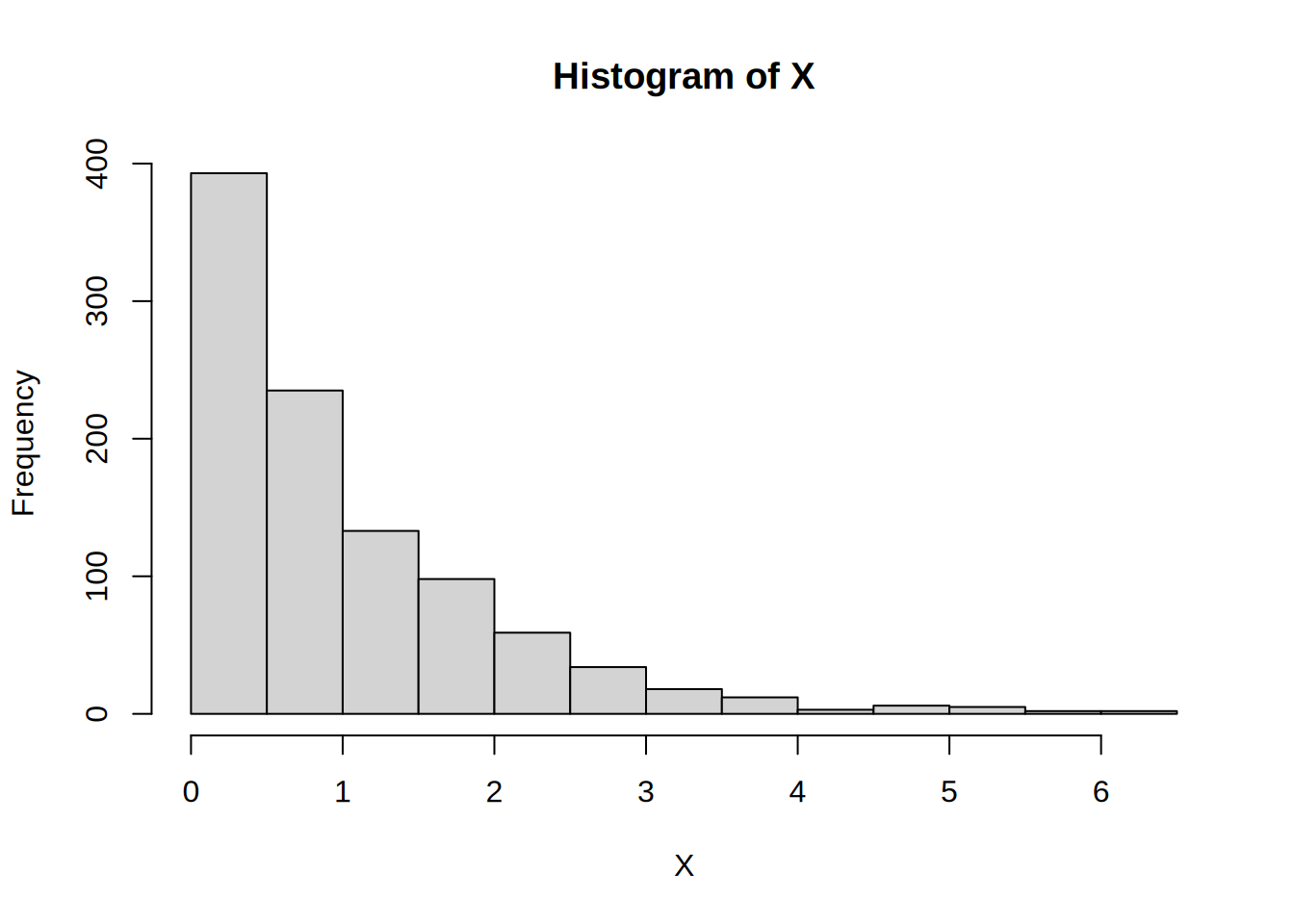
# Compare the empirical CDF with the true exponential CDF
plot(ecdf(X), main = "Empirical vs True Exponential CDF", xlab = "x", ylab = "CDF", col = "blue", lwd = 2)
curve(pexp(x, rate = 1), from = 0, to = max(X), add = TRUE, col = "red", lwd = 2)
legend("bottomright", legend = c("Empirical", "True"), col = c("blue", "red"), lwd = 2)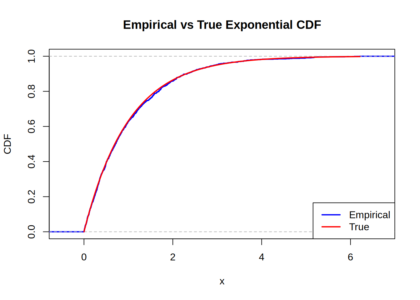
Looks pretty good. Now for the benchmarking
N <- c(10e2, 10e3, 10e4, 10e5)
res <- bench::press(
  N = N,
  {
    bench::mark(
      rexp(N),
      sim_exp(N),
      dqrng::dqrexp(N),
      check = F,
      min_iterations = 20,
      time_unit = "ms"
    )
  }
)
Running with:
N1 10002 100003 1000004 1000000Plot the bench results
autoplot(res)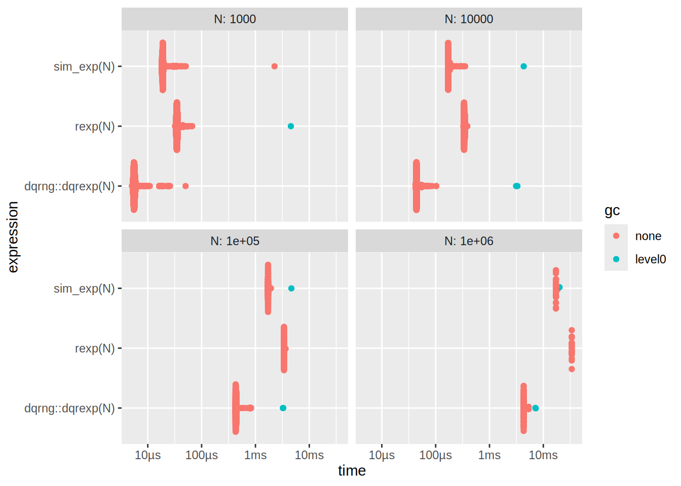
We can also plot the median times
ggplot(res, aes(x = N, y = median, color = as.character(expression))) +
  geom_point() +
  geom_line(aes(group = as.character(expression))) +
  labs(
    x = "N",
    y = "Time (s)",
    title = "Time complexity for increasing N",
  ) +
  theme_minimal()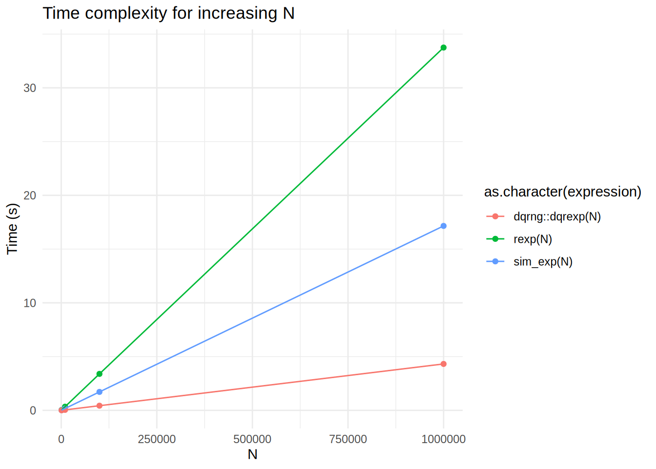
What is going on here? dqrexp is losing to rexp, but also to our sim_exp?
Let’s try to investigate this
Ns <- c(10e2, 10e3, 10e4, 10e5)
res_decompose <- bench::press(
  N = Ns,
  {
    u0 <- runif(N)   # precomputed uniforms (same across expressions)
    bench::mark(
      runif   = { u <- runif(N) },
      dqrunif_dqrng  = { u <- dqrng::dqrunif(N) },
      log_on_u0     = { y <- -log(u0) },              # isolates log cost
      sim_exp       = {-log(runif(N))/1},
      rexp_base     = rexp(N, 1),
      dqrexp_dqrng  = dqrng::dqrexp(N, 1),
      check = FALSE, iterations = 50, time_unit = "ms"
    )
  }
)
Running with:
N1 10002 100003 1000004 1000000Plot the benchmark results
autoplot(res_decompose)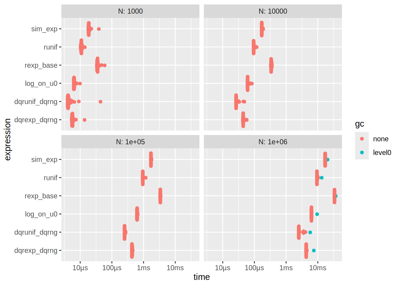
See that also
# time of runif and log on u0
res_decompose[1,]$median + res_decompose[3,]$median
[1] 0.01729251# is approx time of sim_exp
res_decompose[4,]$median[1] 0.01866405# same for N = 1e6
res_decompose[19,]$median + res_decompose[21,]$median[1] 15.76213res_decompose[22,]$median[1] 17.11174On my MacBook Pro with M2 Pro chip, I get that the sim_exp is much faster than rexp which is in turn slightly faster than dqrexp. If you are viewing this exercise on the website, you might see different results due to the different hardware that GitHub CI uses. It is quite difficult to exactly pinpoint the reason why sim_exp is faster than rexp and dqrexp, but it is likely some combination of hardware (running apple silicon) and tooling (compiler differences, R software version, etc.). This is a good illustration of premature optimization. If I had implemented all my functions using dqrexp on my MacBook Pro, I might have optimized the wrong thing and lost performance.
Exercise 5.2
Q: Implement simulation from the t-distribution as in Example 5.2. Test your implementation and benchmark it against against rt().
Solution: Alright my implementation is the following
sim_t <- function(n, k) rnorm(n)/sqrt(rchisq(n, k)/k) We will test it out
N <- 10000
tk1 <- sim_t(N, 1)
tk5 <- sim_t(N, 5)
tk10 <- sim_t(N, 10)

# Get density estimates
dens_tk1 <- density(tk1)
dens_tk5 <- density(tk5)
dens_tk10 <- density(tk10)

# Create a data frame for plotting
dens_df <- data.frame(
  x = c(dens_tk1$x, dens_tk5$x, dens_tk10$x),
  y = c(dens_tk1$y, dens_tk5$y, dens_tk10$y),
  k = factor(rep(c(1, 5, 10), each = length(dens_tk1$x)))
)

# Plot the density estimates
ggplot(dens_df, aes(x = x, y = y, color = k)) +
  geom_line() +
  labs(
    x = "Value",
    y = "Density",
    title = "Density Estimates for t-distribution with different k"
  ) +
  xlim(-5, 5) +
  theme_minimal()
Warning: Removed 970 rows containing missing values or values outside the scale range
(`geom_line()`).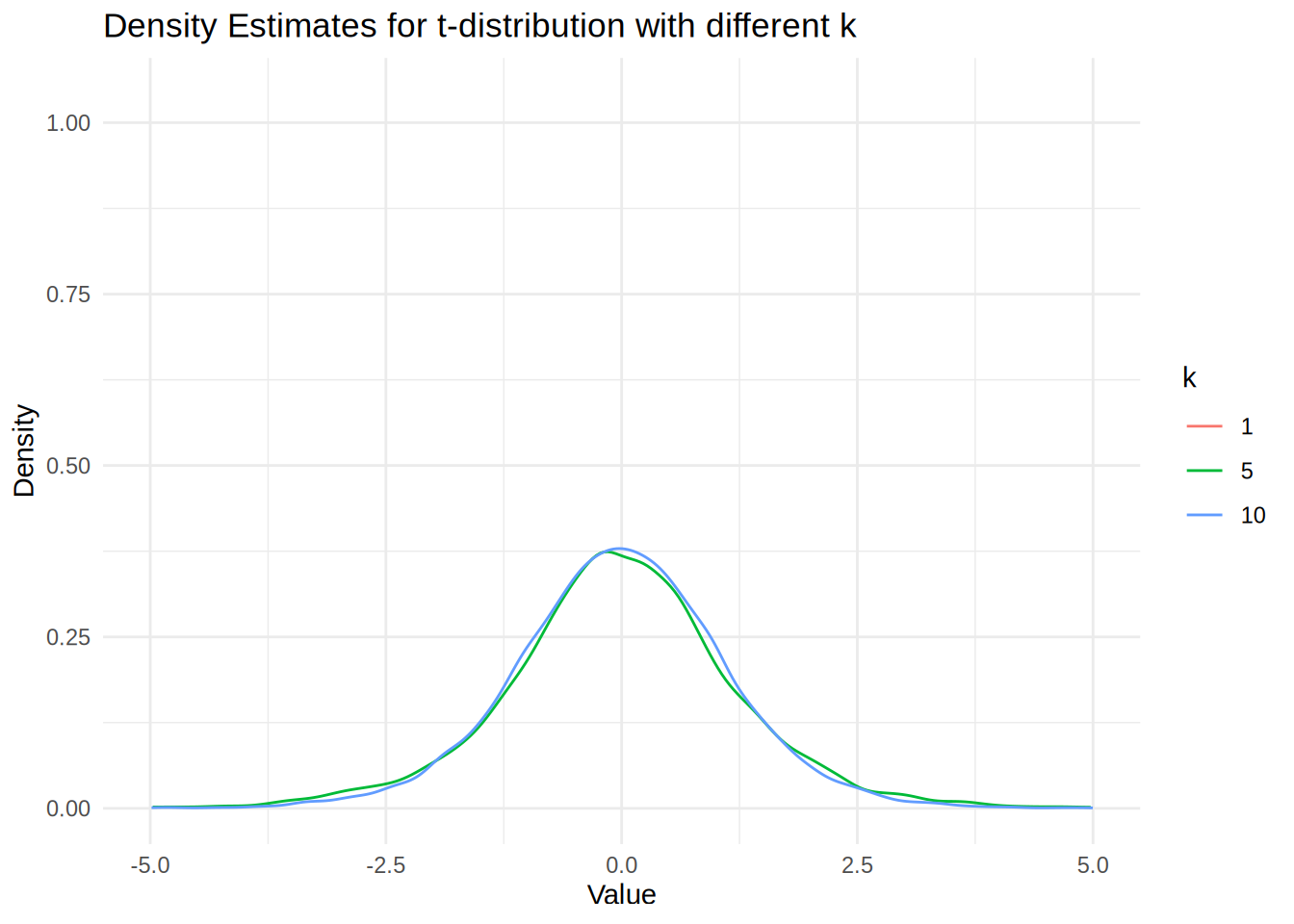
We see that the density estimate for k = 1 is not showing because the t-distribution is very heavy-tailed, which produces extreme outliers that cause the density() function’s automatic bandwidth selection to fail and create numerical instabilities in the kernel smoothing process. The numerical issue arises because the density() function uses automatic bandwidth selection methods (like Scott’s rule or Silverman’s rule) that assume the data has finite variance. However, the t-distribution with k = 1 degree of freedom has infinite variance, causing extreme outliers that fall far outside the typical evaluation grid used by density().
We will now benchmark the two implementations
 N  <- c(10e2, 10e3, 10e4, 10e5)
res2 <- bench::press(
  N = N,
  {
    bench::mark(
      rt(N, df = 5),
      sim_t(N, 5),
      check = F,
      min_iterations = 20,
      time_unit = "ms"
    )
  }
)
Running with:
N1 10002 100003 1000004 1000000Plot the benchmark results
autoplot(res2)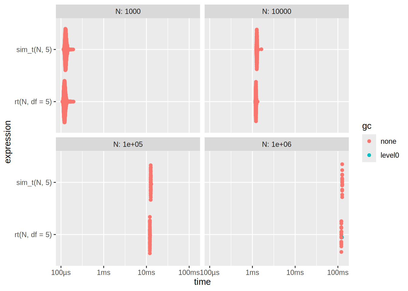
Here we see that rt is slightly bit better